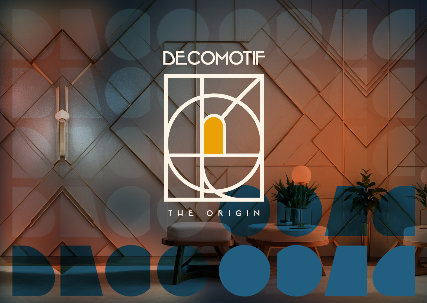
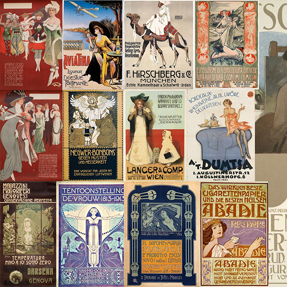
Decomotif is a given name for typeface series who shared the same typographic values and characteristic based from my research results using exploratory approach on fifteen posters published between 1900-1930. My research results highlight there are four main typographic values — symmetric, circular, geometrical, and parabolic. These values are the bedrock of all typefaces in decomotif series, and we explore it into type design process through many design iteration for this series.
Decomotif also marked the beginning of Heypentype’s new type design frameworks. A frameworks based around Marcus Leis Allion explanations of three main approach on designing a typefaces — namely: Experimental, Expressionism, and Exploratory1. This new frameworks emphasised more on typeface conceptual design in order to produce maintainable, modular and expandable typefaces. Therefor I created a symbols to celebrate this achievement and make it into a fonts as a bullet alternates, it can be treated as a logomark for this decomotif series.
Of the name decomotif itself actually a wordplay on Art Deco and Locomotive, but I changed the later into motif. There’s a reason for that, according to a design history, the early phase of 20th century have been marked as an upheaval of various art and design movement responding to major society shifts, wars, and technological innovations2. Art Deco movement and steam locomotive technology and engineering are one of them. Our response on particular events always have a motif behind it.
The most challenging aspect when designing this typeface series are missing lowercase, because the nature of posters — Posters are meant to be seen, not to be read. So, almost all posters use uppercase. It was my main task to create a lowercase letters on all decomotif series typefaces, therefor I always begin with lowercase letter design first in this typeface series.
That was challenging because I don’t have any shape reference from the posters, fortunately I have value guidance from my research results. Those value as stated above assisting me through out the process of designing lowercase letters.
Next are the metrics, this technical things are tricky enough. But fortunately Thomas Phinney suggestions on how to determine typeface metrics that expandable to accommodate various language diacritics are valuable and interesting3. Technically, there will be a different typeface metrics among typefaces in decomotif series, particularly for decomotif fonts that available on MyFonts. This difference will be solved on decomotif update through heypentype’s website, then MyFonts update will follow.
Why metrics needs to be changed?The answers is simple, because we will added new language in the future. The current font metrics already published are not designed to accommodate stacked diacritics I.e Vietnamese diacritics. In order to be compatible with Vietnamese, font metrics must be changed or it will be clipped both on windows and macOS applications. Therefor, for next release I ensure all metrics across decomotif series are uniformed and of course expandable as heypentype new frameworks suggested.
The first typeface release are Decomotif Latte, for more detail about deco latte I will write on next post. This typeface are available both on MyFonts and heypentype fontshop. But if you are looking for the best release look no further than on our own fontshop rather than MyFonts, there are different version, different characters, etc between a fonts released on myfonts and heypentype fontshop. While heypentype’s fonts available through our fontshop will received regular update at least one major update per year, we don’t plan to update regularly on MyFonts.
Written by Rofiki Anas Ma’ruf (@anasisme)
- from Marcus Leis Allion Twitter(X) threads https://x.com/_Undt/status/1650154787550232578 ↩︎
- See https://www.widewalls.ch/magazine/20th-century-design-movements accessed via wayback machine ↩︎
- See https://typedrawers.com/discussion/2805/font-metrics-settings-for-desktop-and-web-fonts ↩︎